Showing posts with label cover. Show all posts

Friday, July 12, 2013

Don't Judge A Book By It's Cover... Even Though Everyone Else Is

by Mindy McGinnis

As a librarian I see the magic of a good book cover firsthand, everyday. I admit that I'm not immune to the siren song of something pretty myself. When the new boxes of books come in you can bet that the ones my ink-stained fingers go for first are the titles with great covers. I'm a librarian, a life-long reader, and an author.

I should know better.

But I can't help it. I'm like a bird flying straight into a window. When it comes to new authors who haven't already proven their mettle to me, the good-looking books get the to the top of the TBR pile every time. I see my patrons doing the same whenever I set up the shiny new things in the designated Shiny New Things Area. A few of the more self-controlled ones try to do intelligent browsing, but most do a dive like a barn swallow spotting an errant mosquito and snatch up whatever looks best.

Authors know this, and we fret. We fret because for the most part our cover is out of our hands. Some of us are fortunate enough to have some control over our cover process, and even more of us are blessed with truly talented art departments that channel our book into a picture. I can't say enough how pleased I am with the cover of NOT A DROP TO DRINK.

But isn't what's between the dust jacket the most important thing? Shouldn't the pages be the motivating factor on what people pick up to, you know - read? Sure, yes, they definitely should. Also I know a lot of ugly guys with great personalities who would love a date sometime in the future.

So what can we do as authors to ensure that our baby looks good?

  • Talk to your agent before the contract is signed. Some houses will negotiate author input on cover design.
  • If you are asked for your ideas before production begins, keep it simple. Don't have specific demands or an exact sketch of what you want. For example, when I was asked my thoughts on what DRINK should look like I said it felt like a "blue" book, and that I didn't want to see my MC's face. Those simple guidelines were put to work, along with someone else's creativity to deliver an awesome cover.
  • Be flexible. Sure, you wanted a black cover and got an orange one. But - why? Maybe black is over and orange pops on the shelf right now. There are reasons for every small thing that goes into your cover.
  • Trust your art department... and thank them! It's our job to write the book, it's their job to make it pretty, not vice-versa. When DRINK's cover was revealed I received a slew of compliments, which I think is pretty funny. Why are people complimenting me? I didn't make it. Mention your designer's name when your cover is praised. They'll remember it. (Ahem, I love you, Erin Fitzsimmons).

And in the end if you hate your cover, don't tell a single soul. Imagine for one second that your book truly is a baby, and someone stops you in the marketplace and says, "Is it a boy or a girl?" And you say, "I don't know, I can't get past how it looks." Um... you just lost at parenting.

Same is true with the publishing industry. You love your book. You love your cover. Smile and make a new one.
_______________________________________________
Mindy McGinnis is a YA author and librarian. Her debut, NOT A DROP TO DRINK, is a post-apocalyptic survival tale set in a world where freshwater is almost non-existent, available from Katherine Tegen / Harper Collins September 24, 2013. She blogs at Writer, Writer Pants on Fire and contributes to the group blogs Book PregnantFriday the ThirteenersFrom the Write AngleThe Class of 2k13The Lucky 13s & The League of Extraordinary Writers. You can also find her on TwitterTumblr & Facebook.

Monday, February 25, 2013

My Baby Gets a New Face: From Hardcover to Paperback


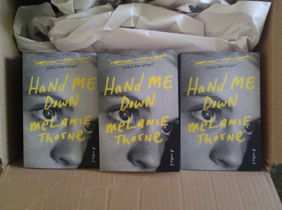
This box of paperbacks showed up at my house the other day:


I don’t have human children, but I imagine it would be a shock to wake up one day and find that the face of your child had been replaced. Her personality, her insides, her soul all remained the same, but outside, she had a brand new look. It’d be pretty strange, right?

I suppose the comparison isn’t exactly the same, but getting a new paperback cover---quite literally a new face in this case---for my novel, Hand Me Down, took some getting used to.

Hardcover
I fell in love with my original hardcover image. It was the first one the publisher presented to me, and my agent and editor and I all loved it. And suddenly, it was like my book was real. This image was the first face of my faceless word document, the first visual representation of my labor of love, and very quickly, it was the image I pictured when I thought of my book. Especially after I held a physical copy with its bound pages and felt the thick matte texture of the jacket, the weight of it in my hands, it was hard to imagine a new face for my baby. But I knew it was coming.

I hated the first proposed paperback design. It felt so wrong for the book—pink and flowery and fluffy and so very, very wrong. Luckily my agent agreed and we asked to see another design. For a while nothing came, and I grew even more attached to the girls on my cover since we spent so much time on the road together, but after a few months I got a new design. It didn’t grab me right away, but I didn't hate it, and I was mulling over its pros and cons when another new design showed up with a note that encouraged me to decide between these two covers relatively quickly. I burst into tears. Neither seemed right, neither seemed like it held a candle to the original cover, and I wished we could just keep it. Why did my beautiful baby need a new look anyway? She looked great the way she was.

I felt pressured by time, was emotionally and physically drained from months of book tour traveling, and was so used to my hardcover that I’m not sure anything would have looked good enough to me in that moment and in that mind set, but my agent LOVED the last image. She thought it was perfect, and even through my pouting I had the good sense to listen to her advice. 

She said that this girl on the new cover was watching, just like Liz does, and then I noticed the moon in her eye, the dusting of downy blonde hair at the top, and I thought maybe my agent was right: that this could be the perfect cover for the book’s new form. And boy, was she right.

Paperback
I now think this close-up black and white face is a striking image that also really represents Liz’s story. The colors pop and the composition makes you want to pick it up and investigate. If Hand Me Down had to get a new face, this a pretty good replacement. And it’s not like the other image will disappear, at least not from my mind. It’s more like a caterpillar turning into a butterfly, a metamorphosis, and the two images live together in my head, both faces equally special.

The hardcover image really focused on two girls: Liz and Jaime, the sisters in the book, who are definitely the core relationship of the story. But I have to admit how much I like that in the long term, in the life that she will live forever, Hand Me Down’s main image is a single girl, who is tough but vulnerable, watching, cautious, but still with the moon in her eyes.
___________________________________________________________________________
Melanie Thorne is the author of Hand Me Down, a debut novel in the tradition of Dorothy Allison and Janet Fitch. A Kirkus Reviews Best Fiction Book of 2012 and a 2013 YALSA Alex Award nominee, Hand Me Down has been widely praised by media, including the San Francisco Chronicle and Daily Candy, and received a “compelling” 3.5/4 stars from People. Melanie earned her MA in Creative Writing from the University of CA, Davis, where she was awarded the Alva Englund Fellowship and the Maurice Prize in Fiction. She lives in Northern California.

Find out more at www.melaniethorne.com, and connect with Melanie on Twitter and Facebook.

Tuesday, November 20, 2012

Evolution of a Book Cover


by Sam Thomas


As other authors here have noted, the actual production of a book can be no less stressful than the writing. From choosing a font to finding blurbs, there are dozens of Is to be dotted and Ts to be crossed. 

But one of the most fascinating is the question of what kind of cover to put on the book. You want one that not only captures both the spirit of the book and the readers eye. It has to tie the book to others in its genre, while at the same time signaling its distinctiveness. It is also a decision that few authors can really control. (Check your contract!)


When I imagined the cover of The Midwife’s Tale, I wanted it to look like a seventeenth-century murder pamphlet like the one on the right. 

The pamphlet would both capture my setting and the central tension of the book, whether a woman would be burned at the stake. To add a little color, I imagined foil overlay in red and orange to make the flames really leap off the page. 

Nice, right?

Except that sometimes I'm not very bright, and I didn't tell anyone about my idea. So, lesson number one: if you want something, say so.


In any event over the summer - about seven months before my due-date -  my editor sent me this cover:

 I was utterly floored. I loved the interplay of darkness and light, the color scheme, the way the light played across the figure’s back… nearly everything about it.

The one concern my agent (not to mention fellow Book Pregnant authors!) had was that it seemed a bit too still. 

I had written a murder story, after all, and we thought it could use a bit more danger. I also suggested replacing the stalks of grain on the table with a mortar and pestle so the midwifery piece was more prominent.

This is where Minotaur came through for me the first time. By all rights, they could have said, “Nope, this is it.” But they didn’t. They came back with a modified cover.


If you look closely, we’ve got a mortar and pestle, and (even better) a knife, but now the scene is dominated by the cooking pot. 

We also now have the question of where the figure’s right arm is. Why isn’t the light that’s illuminating the pot, illuminating the arm?

So we tried again, and once again Minotaur came through gorgeously. We found an image we liked, and then the art department integrated it with the figure in a way that (I hope you'll agree) is nothing short of incredible.


We’ve got a knife (but now it's more menacing) a glass tipped on its side (which also fits with the plot), and even a right arm! I know all parents think their babies are beautiful, but mine really is.

I suppose the moral of the story is that you only get one cover (unless they give you a second one for your paperback!), and you need to find one that you love.

I can’t say enough good things about my agent (Josh Getzler) and editor (Charlie Spicer), as well as the artists at Minotaur/St. Martins,  who put up with my requests that we keep trying. I’m certainly happy, and I hope that they are as well. 


--------------------
Sam Thomas is the author of The Midwife's Tale: A Mystery, which will be published by Minotaur/St. Martins on January 8, 2013. (You can preorder it from Amazon or Mac's Backs. Order from Mac's, and the book will be signed by the author.)

To learn more about the history of midwifery and the real-life midwife behind his protagonist, visit his website at: http://www.samthomasbooks.com. You can also find (and like) him on Facebook at: https://www.facebook.com/SThomasBooks

Friday, October 19, 2012

A cover story, part two!

By Julie Kibler

I posted about seeing my cover for Calling Me Home a few months ago. Then the unexpected happened, which, it turns out, isn't so uncommon in the midst of book pregnancy!

Shortly before I went to New York to meet my agent and editor for the first time in person, I learned my cover art was going to change. At first I was shocked, to be honest. "How can this be happening?" I thought. "Everyone's already seen it. It's plastered everywhere." And, as I mentioned in the original post, even if it takes you a few minutes to decide you love something, it eventually wiggles into your heart and brain. It 
becomes the book, in a way. It becomes part of who your book baby is. And when you learn it's going to change pretty dramatically, it's almost like discovering that your baby, the one you thought had curly red hair and fiery green eyes, is really a silky blonde with eyes like chocolate drops.

I needed some time to take it in. But soon, I remembered that the cover is packaging. It's not the book. It's not the story. And the packaging may change numerous times as various editions of the book release. And in the end, even if the packaging looks a little or a lot different on the outside, the story is still the story. With that realization, I trusted the professionals (in this case, the sales and marketing departments and booksellers) to know better than I do what will allow the story to sell the very best it can.
My old cover art was anchored in metaphor, in symbolism, in nuance. The new cover art tells a story. Some people have commented that since they've seen the new cover, they understand the old one. That was interesting to me and made me realize that sometimes you just need to be blunt. I know exactly what my story is about. I understand perfectly what the gold and silver leaves in the old art represented, but to the reader browsing a bookstore shelf or website, a mysterious cover may just be too mysterious. The new art doesn't necessarily touch on everything the old art did, but it gives the reader a point of reference. 

One of my critique partners showed the new cover art to her 13-year-old son, who knows nothing about the story. He said, "Ohhh, a love story. They are probably driven apart by prejudice." He thought in the end, they would probably be together. I won't spoil the story here, but I can say that this young man made some fairly accurate predictions based simply on the cover art. He knew what he might get it if he picked up Calling Me Home, more or less.

I think this is going to be a good thing. And after wrapping my brain around the change for a few weeks while the art department at my publishing house tweaked and finessed the new cover, I became quite enamored of it. I also had a good reminder of old adage: It's what's on the inside that really counts. I hope you'll be drawn in by this cover, too, enough to discover what's hidden within.


Calling Me Home is available for pre-order now at Amazon, Barnes and Noble, IndieBound, Books-a-Million, and other online retailers! The new cover is trickling in at these sites little by little.


Friday, August 31, 2012

Cover Story: Calling Me Home


Certain days in an Book Pregnant author's life are just a little more special than others. Obviously, there's the day you get "the call" from your dream agent. Then there's the day you make your first sale (and every sale thereafter!). The day you see your manuscript typeset in first pass pages is pretty thrilling, too.

But it's possible one of the most exciting days after you have your book contract in hand is the day you first see your cover. I experienced this once before when I received the file of my German cover art (seen to the left here) and that was pretty mind-boggling. I loved it so much I plastered it all over the place. "Zu zweit tut das Herz nur halb so weh" (Pendo's title for Calling Me Home) released there August 20!

I was on vacation the last few weeks of July. First, we spent several days in Illinois for a family celebration, where I also had the pleasure of meeting fellow Book Pregnant author Amy Sue Nathan (The Glass Wives, Spring 2013).

In the midst of the driving and switching hotel rooms every night or so, my St. Martin's Press editor emailed to request an address where they could overnight something--something NOT work. I knew immediately what it would be! Lydia Netzer, another St. Martin's author and Book Pregnant friend who shares the same fantastic editor, experienced this months earlier when she received her cover for SHINE SHINE SHINE. It would be several days before I could get an overnight delivery without the risk we'd have already moved on, so I gave my editor our upcoming address in the Outer Banks of North Carolina, though I knew I'd go crazy waiting in the four or five days before I'd receive the delivery.

Once we arrived, the rental office promised to call when they received my package. The next day, around 4 p.m. (a day or so sooner than expected!), I got a call. Everyone had just settled in for a late sandwich or nap after our first fun day at the beach. We were sunburned, sandy, unshowered, and exhausted. And yet, my husband, the official driver on the rental car contract, graciously dragged himself up from his comfy spot in front of the television and chauffeured me the ten miles to the office. We arrived with about 15 minutes to spare before they closed.

Design by my now-favorite book cover designer,
Olga Grlic
I carried the book-shaped package to the car, handling it as though I carried an incendiary device. I knew its contents had the potential to create any number of emotions in me. Would I cry when I saw it? From joy? From disappointment? From devastation? Would I clap my hands and scream because I loved it so much? Or would I be angry because the designer and my editor had so utterly ruined the vision my story had conjured in my mind for so many years?

I will tell you this: It was one of the most loaded moments along my journey to publication.

But I also knew this: My editor loves my story. I knew, from previous conversations, she had turned down other prototypes she wasn't pleased with. I trusted she would know the right one when it came along.

So I peeked into the package, just for the littlest glance. Then I read the note my editor had included with her thoughts on why this one worked so well and how in love the staff at St. Martin's was with it. How they literally gasped when they saw it the first time. Then I pulled the cover, which she had carefully wrapped and taped around another hardcover book so I could get the full effect, from the envelope.

Strangely, my reaction was not unlike my reaction 15, 18, and 23 years ago, each time I saw one of my beautiful children for the first time. I am not a screamer. I am not a clapper. I am not one to cry at expected times. When I held and studied each of my babies the very first time, I felt strangely awed. Reverent. Quiet. I simply stared at their faces, then studied each limb, each tiny fingernail, so surprised to see how different they looked than I'd ever imaged, yet somehow so perfect. On an intellectual level, I knew I already loved them more than I ever dreamed I was capable of doing, but on a human level, I wasn't quite able to grasp that just yet. With each child, it was hours before the emotions really began to flow, before I was finally able to wrap my brain around their arrivals, their surprising perfection, their little bits of me and their characteristics I never, ever, imagined. And then, I was carrying them around, showing them off, placing them here and there for photos--which light, which background, which setting could possibly show the world what I was seeing through my eyes?

And that Monday in July, before long, I was carrying my "book" around my vacation home, placing it on the hammock in the ocean breeze for a shot here, propping it in the port hole window with a view of the Outer Banks there, stacking it with a book about the Outer Banks so I'd never forget where I saw it the first time.

And I loved it. 

Five weeks later, I love it even more. Yesterday, I received my advance reader editions, and seeing the cover attached to my "real" book, though shiny where it will be matte, and paperback where it will eventually be a slipcover around a hardbound book, my affection simply continues to grow, just as it has every day and every year  for my amazing human babies.

Calling Me Home is available for pre-order now at Amazon and BN.com and many other sites. More info about the book is available at my websitePre-orders are really important in the lead-up to publication, so all of us at Book Pregnant truly appreciate those who take the time to order one of our books in advance. You are guaranteed the lowest price up to the shipping date once you place your order on many sites. 

A version of this post first appeared on my group blog, What Women Write


Wednesday, May 30, 2012

Cover Story: How My Book Got Its Face


I'm a sucker for pretty book covers. I always have been. As a kid in libraries, I’d scan the shelves for anything that caught my eye. I picked up Twilight in a bookstore knowing nothing about it other than it was a vampire story—I fell in love with vampires in 6th grade—and that the cover was beautiful. The striking red of the apple against the stark white of the cupped hands and angled forearms, the black background and silver title sold me in about two seconds. I didn’t love the book and didn’t read any of the sequels, but every time I pull Twilight out to get rid of it, I end up admiring the cover like a work of art and put it back on my shelf. 

My bookcases are filled with pretty books. I mean, all books are beautiful, but those with pretty faces as well as words are likely to go far in our visual culture. It may not be fair, but it’s true: people judge books by their covers all the time. So we authors cross our fingers that we’ll get a good one, because the thing is, we don’t have much control over the cover.

When I sold my novel, it was a Word document on my computer; a manuscript I hadn’t printed out in its entirety for years. It wasn’t yet a physical object, or rather its physicality was blank. When I pictured my book as a thing, it looked like a pile of papers, a faceless body of words.

Then one day, an image magically appeared in my email inbox. No one had told me exactly when I’d see my cover, or what it might look like. No one had asked me for any ideas or input, though I suppose, if I’d had strong opinions about my vision, I would have said so. I know other authors who sent photos or drawings, or other covers they loved. I did none of that and yet there it was as an attachment from my editor. I held my breath as I waited for it to load. Suddenly, my book was looking back at me.

I didn’t immediately fall in love. At first, I didn’t know what I thought. How do you react to finally seeing the face of a being you know so intimately? My book and I were like one of those couples who meet online or through the paper and write to each other and talk on the phone for months, revealing every detail about themselves without having seen any photos, the internal so familiar and the external only imagined. A face-to-face encounter changes the whole relationship in a second.

Generally, an author is shown a cover from the designer. She then has three options: reject, accept, or request changes. Of course, there are always those horror stories of authors who had no say at all and hated their covers, but I have also heard of authors going through three or five versions to find one that’s exactly right. For good reason—a book’s cover is how it presents itself to the world. It’s important. Like you’d choose an outfit based on your activity, your cover should fit your audience, should give a sense of the book’s mood, should make people want to pick it up and hold it in their hands.

It’s a partnership, working with a publisher, so you may not get exactly what you envisioned all those years as you built a relationship with your book. And some authors have told me that was a good thing: that the design their publisher presented was so much better that what they’d asked for; better than they’d imagined. The designers are, after all, designers. Try to be open-minded.

When you do see her face for the first time, it’s less complicated than meeting your internet boyfriend in person because, unlike his, the book's face isn't permanent. You can change it. If you hate your cover or you really feel that something isn’t working, speak up! Be polite and respectful, but say something. Your cover is what everyone will see, what your book will wear out in the world, her shining face. It should be something that feels right for her, and for you.

Isn't she pretty?
I know I was lucky with my cover. After the initial shock wore off, I decided I liked it. I really liked it. I asked for a few changes—small adjustments to colors, lightening the girls’ hair which was originally black and my characters are blond—and now I’m head over heels in love with it. I love the colors and the font and the ragged edges. I love the interesting composition, eye-catching photo, the feeling of protectiveness between the two girls, and their vulnerability. It captures the "tough and tender" tone of Hand Me Down perfectly. Now, I can’t imagine my book without this beautiful face.

Find out more about Hand Me Down at www.melaniethorne.com